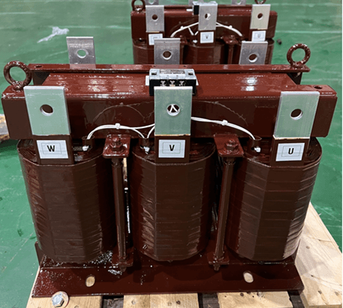
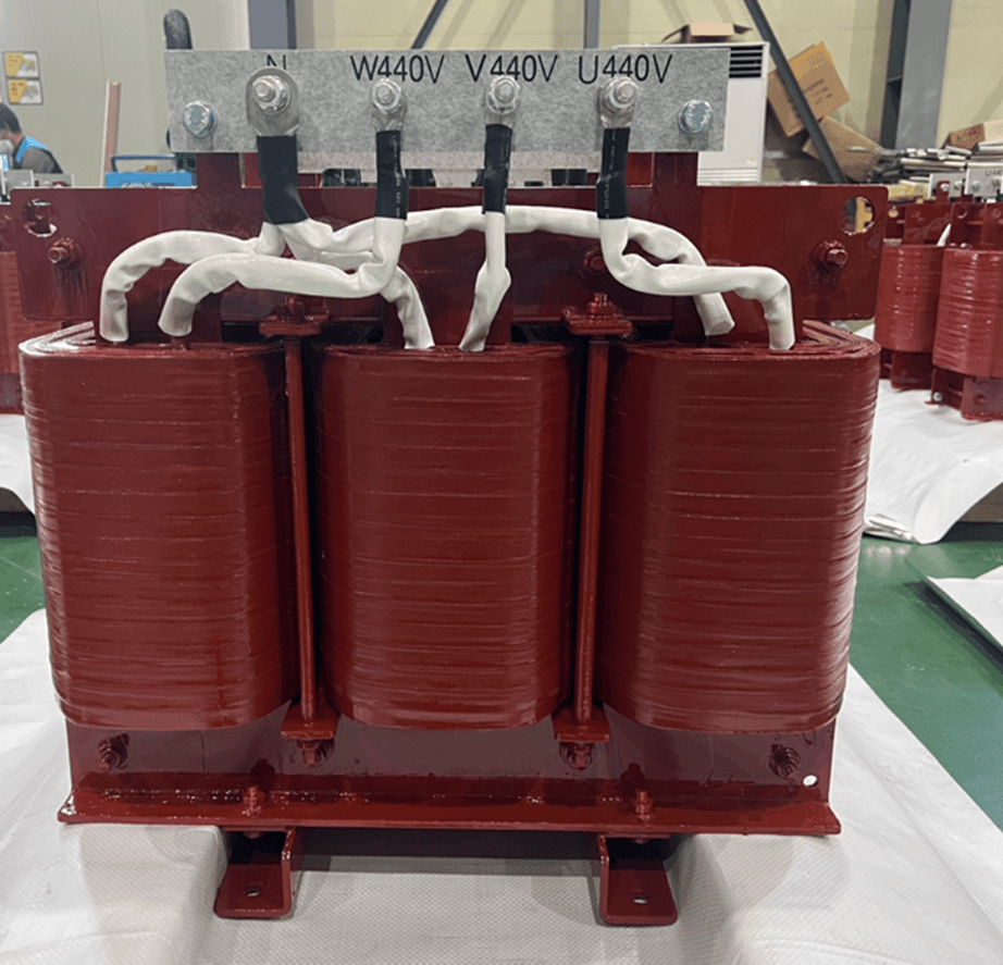
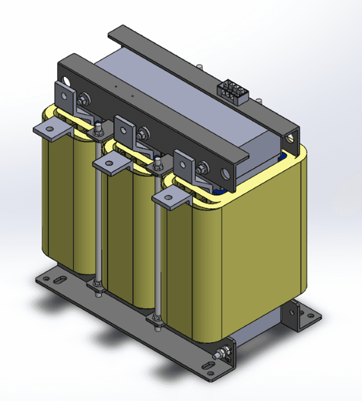
Dry Type TRANSFORMER
Dry Type TRANSFORMER
And
REACTORS.
REACTORS.
I will continue to repay your support with the best products through continuous research and development in the future.
Dry Type TRANSFORMER
And
REACTORS.
I will continue to repay your support with the best products through continuous research and development in the future.

Starting and Growing a Career in Web Design
As the internet continues to develop and grow exponentially, jobs related to the industry do too, particularly those that relate to web design and development. The prediction is that by 2029, the job outlook for these two fields will grow by 8%—significantly faster than average. Whether you’re seeking salaried employment or aiming to work in a freelance capacity, a career in web design can offer a variety of employment arrangements, competitive salaries, and opportunities to utilize both technical and creative skill sets.
What does a career in web design involve?
A career in website design can involve the design, creation, and coding of a range of website types. Other tasks will typically include liaising with clients and discussing website specifications, incorporating feedback, working on graphic design and image editing, and enabling multimedia features such as audio and video. Requiring a range of creative and technical skills, web designers may be involved in work across a range of industries, including software companies, IT consultancies, web design companies, corporate organizations, and more. In contrast with web developers, web designers tend to play a more creative role, crafting the overall vision and design of a site, and determining how to best incorporate the necessary functionality. However, there can be significant overlap between the roles.
Full-stack, back-end, and front-end web development
The U.S. Bureau of Labor Statistics (BLS) Occupational Outlook Handbook tends to group web developers and digital designers into one category. However, they define them separately, stating that web developers create and maintain websites and are responsible for the technical aspects including performance and capacity. Web or digital designers, on the other hand, are responsible for the look and functionality of websites and interfaces. They develop, create, and test the layout, functions, and navigation for usability. Web developers can focus on the back-end, front-end, or full-stack development, and typically utilize a range of programming languages, libraries, and frameworks to do so. Web designers may work more closely with front-end engineers to establish the user-end functionality and appearance of a site.
Are web designers in demand in 2022?
In our ever-increasingly digital environment, there is a constant need for websites—and therefore for web designers and developers. With 17.4 billion websites in existence as of January 2020, the demand for web developers is only expected to rise.Web designers with significant coding experience are typically in higher demand, and can usually expect a higher salary. Like all jobs, there are likely to be a range of opportunities, some of which are better paid than others. But certain skill sets are basic to web design, most of which are key to how to become a web designer in 2022.
Apr 8, 2022

Create a Landing Page That Performs Great
Whether you work in marketing, sales, or product design, you understand the importance of a quality landing page. Landing pages are standalone websites used to generate leads or sales—in other words they help you increase your revenue. Unlike typical web pages, landing pages only have one call to action, or CTA, and they are usually tied to a specific marketing or advertising campaign. The hyper-focused nature of landing pages means they come with a pretty standard set of best practices.
Landing pages vs. front pages
A typical front page or website in general includes a full navigation bar with tons of links throughout the page linking to other pages or pieces of content. A good landing page should only have one link, or multiple links that all point to the same thing. Having one CTA on your landing page increases conversions because there’s less distraction—fewer equally appealing options to prompt your users into leaving your landing page.
Your brand’s front page has totally different goals. It should show off your brand’s personality, let people explore different features, find blogs and support articles, or even apply for a job. But they won’t necessarily purchase your product from the front page. And that’s why we need landing pages.
Since landing pages are tied to specific campaigns, you don’t need to worry about users lacking information about your product. They arrived at your landing page because they were interested in an ad or post on Google, Bing, YouTube, Facebook, Instagram, Twitter, or similar places on the web. With super detailed campaigns pointing to easy-to-use landing pages, you’re getting high-quality leads that are actually interested in using your product.
Best practices for creating a landing page
What makes an easy-to-use landing page? Overall it’s clear, concise, and doesn’t give users any options except for the main CTA.In terms of copy, your landing page should have one clear message. The header of your page should promote the desired action you want visitors to take. And additionally it should explain the benefits of performing this action.
The visual design of your page should be very simple. Unlike your front page, this is not the place to go crazy with brand personality—so no wild animations or complex design elements. You wouldn’t want to distract visitors from performing the main action of your page.
Landing page CTA’s are typically buttons, sometimes accompanied by an input field if you need to collect user information. To ensure your buttons are clicked, make sure they stand out visually. This can be done with contrasting the button color with your page background and clear copy on the button itself. For example, if you are asking visitors to book a demo, write“Book a demo” clearly on the CTA button.
Mar 15, 2022

How Can Designers Prepare for the Future?
Last month, I had the chance to attend CSS Day in Amsterdam, a two day event split between a “UI day” focusing on the intersection of design and development and a “CSS day”, with speakers who covered more in-depth, technical CSS subjects. The talks were as diverse as the background of the speakers themselves, but there was one common thread: In this era of rapid change, are we, as product people, equipped to design for automation, machine learning, and AI?
What does automation mean for designers?
It's hard to work on a product team that hasn’t automated some part of their workflow in the name of productivity. If machines can take care of the repeatable tasks and heavy lifting, designers can focus on doing more meaningful work. But how does this affect the way we use the work being created by machines?
Josh Clark, founder of design studio Big Medium, provoked the audience with this very question during his talk, ‘A.I. is your New Design Material’. Some of the most impressive advancements in recent technology are things like facial recognition, predictive text, and image search, all powered by machine learning. But it's important to remember—all of these technologies are still built on code. The upside is less room for error. No real emotions, expectations, or feelings get in the way of the job it was designed to do.
Yet, as humans, we assume that when facial recognition fails, the whole process is inherently flawed. But was it really?
According to Josh, that is the most fundamental thing to understand when it comes to machines. Not meeting our human expectations, doesn’t automatically make the technology itself a failure. These things were, by definition, built on logic, which begs the question: Can a robot's solution actually be wrong?
The point of introducing machine learning into our products was never to have them do all the work. Instead, algorithms and logic-based solutions ought only provide humans with better insight so as to empower us to arrive at better solutions, faster.
This fundamental understanding our users that really helps us make better products. This might be a simple example, but if a computer can figure out how to walk on it's own, maybe it's time to start investigating why and how these solutions were formed.
How do we design for the unknown future?
Jared Spool, Co-Founder of UIE asks, “What was the most important thing you learned yesterday, and how will it impact what you do in the future?”
As designers and researchers, we essentially always need to think about how we design products for the future, even as we’re meeting the demands of present day design. A tall order, especially when things move as fast as they have been over the last decade.
To start, Jared advocates for looking back at the ways in which our design processes have already changed.
Remember when UX/UI wasn't a priority for many companies? As a consultant during a time when the Internet had yet to hit mass market appeal, Jared was able to steer many companies into a mindset that considered the user experience of a product.
But this also lets us gain input into how UX and UI has looked over the years, which might give us a better idea of what these concepts will look like moving forward. Jared describes a term called "The UX Tipping Point", with great actionable steps on how to get there.
In the past, designers had to fight for a seat at the table. If today you’re not starting from a place of advocating for user experience (like they were 10 years ago), they’re likely not starting at that tipping point. As a result, designers still have to ensure that the role of UX matures within the company, as well as the understanding of what makes UX important. When an organization hits the last stage, and fully embraces UX design from everything the company does, they fully hit The UX Tipping Point.
Are we designing for users or ourselves?
People don't always know what they want, even if they think the do. As Joe Leech, a UX psychologist says, "People want more choices, but can't deal with them.”
So how do we design for our users, if our users aren’t always telling us the truth? This is one of the most important questions, and something that extensive UX research helps us accomplish.
Back in the 2000s, psychologists Sheena Iyengar and Mark Lepper ran a study regarding consumer choices. They went to a local supermarket, and instructed the store to only sell 6 varieties of jam one week, followed by 30 varieties the following week.
They ran a study on how much jam was sold, and to everyone's surprise, more jam was sold on the week with only 6 choices. But interestingly enough, when the consumers were asked which week they preferred more, they responded with the week that had 30 choices.
Using this analogy, Joe makes a point that is hard to argue with, “A designer who doesn't understand psychology is going to be more successful than an architect who doesn't understand physics".
User research, and a wide variety of it, helps teams get as close as possible to the root of a user’s needs, over their wants. Studying responses on a larger scale is more work, but it helps form the foundation for true UX.
Feb 28, 2022

Starting and Growing a Career in Web Design
As the internet continues to develop and grow exponentially, jobs related to the industry do too, particularly those that relate to web design and development. The prediction is that by 2029, the job outlook for these two fields will grow by 8%—significantly faster than average. Whether you’re seeking salaried employment or aiming to work in a freelance capacity, a career in web design can offer a variety of employment arrangements, competitive salaries, and opportunities to utilize both technical and creative skill sets.
What does a career in web design involve?
A career in website design can involve the design, creation, and coding of a range of website types. Other tasks will typically include liaising with clients and discussing website specifications, incorporating feedback, working on graphic design and image editing, and enabling multimedia features such as audio and video. Requiring a range of creative and technical skills, web designers may be involved in work across a range of industries, including software companies, IT consultancies, web design companies, corporate organizations, and more. In contrast with web developers, web designers tend to play a more creative role, crafting the overall vision and design of a site, and determining how to best incorporate the necessary functionality. However, there can be significant overlap between the roles.
Full-stack, back-end, and front-end web development
The U.S. Bureau of Labor Statistics (BLS) Occupational Outlook Handbook tends to group web developers and digital designers into one category. However, they define them separately, stating that web developers create and maintain websites and are responsible for the technical aspects including performance and capacity. Web or digital designers, on the other hand, are responsible for the look and functionality of websites and interfaces. They develop, create, and test the layout, functions, and navigation for usability. Web developers can focus on the back-end, front-end, or full-stack development, and typically utilize a range of programming languages, libraries, and frameworks to do so. Web designers may work more closely with front-end engineers to establish the user-end functionality and appearance of a site.
Are web designers in demand in 2022?
In our ever-increasingly digital environment, there is a constant need for websites—and therefore for web designers and developers. With 17.4 billion websites in existence as of January 2020, the demand for web developers is only expected to rise.Web designers with significant coding experience are typically in higher demand, and can usually expect a higher salary. Like all jobs, there are likely to be a range of opportunities, some of which are better paid than others. But certain skill sets are basic to web design, most of which are key to how to become a web designer in 2022.
Apr 8, 2022

Create a Landing Page That Performs Great
Whether you work in marketing, sales, or product design, you understand the importance of a quality landing page. Landing pages are standalone websites used to generate leads or sales—in other words they help you increase your revenue. Unlike typical web pages, landing pages only have one call to action, or CTA, and they are usually tied to a specific marketing or advertising campaign. The hyper-focused nature of landing pages means they come with a pretty standard set of best practices.
Landing pages vs. front pages
A typical front page or website in general includes a full navigation bar with tons of links throughout the page linking to other pages or pieces of content. A good landing page should only have one link, or multiple links that all point to the same thing. Having one CTA on your landing page increases conversions because there’s less distraction—fewer equally appealing options to prompt your users into leaving your landing page.
Your brand’s front page has totally different goals. It should show off your brand’s personality, let people explore different features, find blogs and support articles, or even apply for a job. But they won’t necessarily purchase your product from the front page. And that’s why we need landing pages.
Since landing pages are tied to specific campaigns, you don’t need to worry about users lacking information about your product. They arrived at your landing page because they were interested in an ad or post on Google, Bing, YouTube, Facebook, Instagram, Twitter, or similar places on the web. With super detailed campaigns pointing to easy-to-use landing pages, you’re getting high-quality leads that are actually interested in using your product.
Best practices for creating a landing page
What makes an easy-to-use landing page? Overall it’s clear, concise, and doesn’t give users any options except for the main CTA.In terms of copy, your landing page should have one clear message. The header of your page should promote the desired action you want visitors to take. And additionally it should explain the benefits of performing this action.
The visual design of your page should be very simple. Unlike your front page, this is not the place to go crazy with brand personality—so no wild animations or complex design elements. You wouldn’t want to distract visitors from performing the main action of your page.
Landing page CTA’s are typically buttons, sometimes accompanied by an input field if you need to collect user information. To ensure your buttons are clicked, make sure they stand out visually. This can be done with contrasting the button color with your page background and clear copy on the button itself. For example, if you are asking visitors to book a demo, write“Book a demo” clearly on the CTA button.
Mar 15, 2022

How Can Designers Prepare for the Future?
Last month, I had the chance to attend CSS Day in Amsterdam, a two day event split between a “UI day” focusing on the intersection of design and development and a “CSS day”, with speakers who covered more in-depth, technical CSS subjects. The talks were as diverse as the background of the speakers themselves, but there was one common thread: In this era of rapid change, are we, as product people, equipped to design for automation, machine learning, and AI?
What does automation mean for designers?
It's hard to work on a product team that hasn’t automated some part of their workflow in the name of productivity. If machines can take care of the repeatable tasks and heavy lifting, designers can focus on doing more meaningful work. But how does this affect the way we use the work being created by machines?
Josh Clark, founder of design studio Big Medium, provoked the audience with this very question during his talk, ‘A.I. is your New Design Material’. Some of the most impressive advancements in recent technology are things like facial recognition, predictive text, and image search, all powered by machine learning. But it's important to remember—all of these technologies are still built on code. The upside is less room for error. No real emotions, expectations, or feelings get in the way of the job it was designed to do.
Yet, as humans, we assume that when facial recognition fails, the whole process is inherently flawed. But was it really?
According to Josh, that is the most fundamental thing to understand when it comes to machines. Not meeting our human expectations, doesn’t automatically make the technology itself a failure. These things were, by definition, built on logic, which begs the question: Can a robot's solution actually be wrong?
The point of introducing machine learning into our products was never to have them do all the work. Instead, algorithms and logic-based solutions ought only provide humans with better insight so as to empower us to arrive at better solutions, faster.
This fundamental understanding our users that really helps us make better products. This might be a simple example, but if a computer can figure out how to walk on it's own, maybe it's time to start investigating why and how these solutions were formed.
How do we design for the unknown future?
Jared Spool, Co-Founder of UIE asks, “What was the most important thing you learned yesterday, and how will it impact what you do in the future?”
As designers and researchers, we essentially always need to think about how we design products for the future, even as we’re meeting the demands of present day design. A tall order, especially when things move as fast as they have been over the last decade.
To start, Jared advocates for looking back at the ways in which our design processes have already changed.
Remember when UX/UI wasn't a priority for many companies? As a consultant during a time when the Internet had yet to hit mass market appeal, Jared was able to steer many companies into a mindset that considered the user experience of a product.
But this also lets us gain input into how UX and UI has looked over the years, which might give us a better idea of what these concepts will look like moving forward. Jared describes a term called "The UX Tipping Point", with great actionable steps on how to get there.
In the past, designers had to fight for a seat at the table. If today you’re not starting from a place of advocating for user experience (like they were 10 years ago), they’re likely not starting at that tipping point. As a result, designers still have to ensure that the role of UX matures within the company, as well as the understanding of what makes UX important. When an organization hits the last stage, and fully embraces UX design from everything the company does, they fully hit The UX Tipping Point.
Are we designing for users or ourselves?
People don't always know what they want, even if they think the do. As Joe Leech, a UX psychologist says, "People want more choices, but can't deal with them.”
So how do we design for our users, if our users aren’t always telling us the truth? This is one of the most important questions, and something that extensive UX research helps us accomplish.
Back in the 2000s, psychologists Sheena Iyengar and Mark Lepper ran a study regarding consumer choices. They went to a local supermarket, and instructed the store to only sell 6 varieties of jam one week, followed by 30 varieties the following week.
They ran a study on how much jam was sold, and to everyone's surprise, more jam was sold on the week with only 6 choices. But interestingly enough, when the consumers were asked which week they preferred more, they responded with the week that had 30 choices.
Using this analogy, Joe makes a point that is hard to argue with, “A designer who doesn't understand psychology is going to be more successful than an architect who doesn't understand physics".
User research, and a wide variety of it, helps teams get as close as possible to the root of a user’s needs, over their wants. Studying responses on a larger scale is more work, but it helps form the foundation for true UX.
Feb 28, 2022

Starting and Growing a Career in Web Design
As the internet continues to develop and grow exponentially, jobs related to the industry do too, particularly those that relate to web design and development. The prediction is that by 2029, the job outlook for these two fields will grow by 8%—significantly faster than average. Whether you’re seeking salaried employment or aiming to work in a freelance capacity, a career in web design can offer a variety of employment arrangements, competitive salaries, and opportunities to utilize both technical and creative skill sets.
What does a career in web design involve?
A career in website design can involve the design, creation, and coding of a range of website types. Other tasks will typically include liaising with clients and discussing website specifications, incorporating feedback, working on graphic design and image editing, and enabling multimedia features such as audio and video. Requiring a range of creative and technical skills, web designers may be involved in work across a range of industries, including software companies, IT consultancies, web design companies, corporate organizations, and more. In contrast with web developers, web designers tend to play a more creative role, crafting the overall vision and design of a site, and determining how to best incorporate the necessary functionality. However, there can be significant overlap between the roles.
Full-stack, back-end, and front-end web development
The U.S. Bureau of Labor Statistics (BLS) Occupational Outlook Handbook tends to group web developers and digital designers into one category. However, they define them separately, stating that web developers create and maintain websites and are responsible for the technical aspects including performance and capacity. Web or digital designers, on the other hand, are responsible for the look and functionality of websites and interfaces. They develop, create, and test the layout, functions, and navigation for usability. Web developers can focus on the back-end, front-end, or full-stack development, and typically utilize a range of programming languages, libraries, and frameworks to do so. Web designers may work more closely with front-end engineers to establish the user-end functionality and appearance of a site.
Are web designers in demand in 2022?
In our ever-increasingly digital environment, there is a constant need for websites—and therefore for web designers and developers. With 17.4 billion websites in existence as of January 2020, the demand for web developers is only expected to rise.Web designers with significant coding experience are typically in higher demand, and can usually expect a higher salary. Like all jobs, there are likely to be a range of opportunities, some of which are better paid than others. But certain skill sets are basic to web design, most of which are key to how to become a web designer in 2022.
Apr 8, 2022

Create a Landing Page That Performs Great
Whether you work in marketing, sales, or product design, you understand the importance of a quality landing page. Landing pages are standalone websites used to generate leads or sales—in other words they help you increase your revenue. Unlike typical web pages, landing pages only have one call to action, or CTA, and they are usually tied to a specific marketing or advertising campaign. The hyper-focused nature of landing pages means they come with a pretty standard set of best practices.
Landing pages vs. front pages
A typical front page or website in general includes a full navigation bar with tons of links throughout the page linking to other pages or pieces of content. A good landing page should only have one link, or multiple links that all point to the same thing. Having one CTA on your landing page increases conversions because there’s less distraction—fewer equally appealing options to prompt your users into leaving your landing page.
Your brand’s front page has totally different goals. It should show off your brand’s personality, let people explore different features, find blogs and support articles, or even apply for a job. But they won’t necessarily purchase your product from the front page. And that’s why we need landing pages.
Since landing pages are tied to specific campaigns, you don’t need to worry about users lacking information about your product. They arrived at your landing page because they were interested in an ad or post on Google, Bing, YouTube, Facebook, Instagram, Twitter, or similar places on the web. With super detailed campaigns pointing to easy-to-use landing pages, you’re getting high-quality leads that are actually interested in using your product.
Best practices for creating a landing page
What makes an easy-to-use landing page? Overall it’s clear, concise, and doesn’t give users any options except for the main CTA.In terms of copy, your landing page should have one clear message. The header of your page should promote the desired action you want visitors to take. And additionally it should explain the benefits of performing this action.
The visual design of your page should be very simple. Unlike your front page, this is not the place to go crazy with brand personality—so no wild animations or complex design elements. You wouldn’t want to distract visitors from performing the main action of your page.
Landing page CTA’s are typically buttons, sometimes accompanied by an input field if you need to collect user information. To ensure your buttons are clicked, make sure they stand out visually. This can be done with contrasting the button color with your page background and clear copy on the button itself. For example, if you are asking visitors to book a demo, write“Book a demo” clearly on the CTA button.
Mar 15, 2022

How Can Designers Prepare for the Future?
Last month, I had the chance to attend CSS Day in Amsterdam, a two day event split between a “UI day” focusing on the intersection of design and development and a “CSS day”, with speakers who covered more in-depth, technical CSS subjects. The talks were as diverse as the background of the speakers themselves, but there was one common thread: In this era of rapid change, are we, as product people, equipped to design for automation, machine learning, and AI?
What does automation mean for designers?
It's hard to work on a product team that hasn’t automated some part of their workflow in the name of productivity. If machines can take care of the repeatable tasks and heavy lifting, designers can focus on doing more meaningful work. But how does this affect the way we use the work being created by machines?
Josh Clark, founder of design studio Big Medium, provoked the audience with this very question during his talk, ‘A.I. is your New Design Material’. Some of the most impressive advancements in recent technology are things like facial recognition, predictive text, and image search, all powered by machine learning. But it's important to remember—all of these technologies are still built on code. The upside is less room for error. No real emotions, expectations, or feelings get in the way of the job it was designed to do.
Yet, as humans, we assume that when facial recognition fails, the whole process is inherently flawed. But was it really?
According to Josh, that is the most fundamental thing to understand when it comes to machines. Not meeting our human expectations, doesn’t automatically make the technology itself a failure. These things were, by definition, built on logic, which begs the question: Can a robot's solution actually be wrong?
The point of introducing machine learning into our products was never to have them do all the work. Instead, algorithms and logic-based solutions ought only provide humans with better insight so as to empower us to arrive at better solutions, faster.
This fundamental understanding our users that really helps us make better products. This might be a simple example, but if a computer can figure out how to walk on it's own, maybe it's time to start investigating why and how these solutions were formed.
How do we design for the unknown future?
Jared Spool, Co-Founder of UIE asks, “What was the most important thing you learned yesterday, and how will it impact what you do in the future?”
As designers and researchers, we essentially always need to think about how we design products for the future, even as we’re meeting the demands of present day design. A tall order, especially when things move as fast as they have been over the last decade.
To start, Jared advocates for looking back at the ways in which our design processes have already changed.
Remember when UX/UI wasn't a priority for many companies? As a consultant during a time when the Internet had yet to hit mass market appeal, Jared was able to steer many companies into a mindset that considered the user experience of a product.
But this also lets us gain input into how UX and UI has looked over the years, which might give us a better idea of what these concepts will look like moving forward. Jared describes a term called "The UX Tipping Point", with great actionable steps on how to get there.
In the past, designers had to fight for a seat at the table. If today you’re not starting from a place of advocating for user experience (like they were 10 years ago), they’re likely not starting at that tipping point. As a result, designers still have to ensure that the role of UX matures within the company, as well as the understanding of what makes UX important. When an organization hits the last stage, and fully embraces UX design from everything the company does, they fully hit The UX Tipping Point.
Are we designing for users or ourselves?
People don't always know what they want, even if they think the do. As Joe Leech, a UX psychologist says, "People want more choices, but can't deal with them.”
So how do we design for our users, if our users aren’t always telling us the truth? This is one of the most important questions, and something that extensive UX research helps us accomplish.
Back in the 2000s, psychologists Sheena Iyengar and Mark Lepper ran a study regarding consumer choices. They went to a local supermarket, and instructed the store to only sell 6 varieties of jam one week, followed by 30 varieties the following week.
They ran a study on how much jam was sold, and to everyone's surprise, more jam was sold on the week with only 6 choices. But interestingly enough, when the consumers were asked which week they preferred more, they responded with the week that had 30 choices.
Using this analogy, Joe makes a point that is hard to argue with, “A designer who doesn't understand psychology is going to be more successful than an architect who doesn't understand physics".
User research, and a wide variety of it, helps teams get as close as possible to the root of a user’s needs, over their wants. Studying responses on a larger scale is more work, but it helps form the foundation for true UX.
Feb 28, 2022
Contact us
Tel.
Tel.
Tel.
FAX
Tel.
Tel.
114, Hwanggeum 3-ro 8beon-gil, Yangchon-eup, Gimpo-si, Gyeonggi-do, Republic of Korea (10048)
114, Hwanggeum 3-ro 8beon-gil, Yangchon-eup, Gimpo-si, Gyeonggi-do, Republic of Korea (10048)
Get the catalog
Get the catalog
Get the catalog
Get the catalog
